Branding | Strategy | Iconography | Illustration
Procore Identity
I had the pleasure of working with a small and mighty team tasked with refreshing the global Procore Technologies brand. Procore is an international software company specializing in streamlining the construction process. Founded in 2002, the original logo was already well recognized and received — the problem presented was maintaining brand recognition while refreshing the brand to allow for future scalability. This massive project scope included restructuring product architecture, updating the logo and colors, developing a repeatable system for product iconography, and developing an isometric illustration style.
In collaboration with Ian Schechter and Karen Owens.
Branding
Strategy
Art Direction
Color Research
Isometric Illustration
Digital + Print Design
Iconography

The Brief
Create a visual identity system for our entire suite of products that stands the test of time.
This system should amplify the existing Procore brand, yet bring new innovation that feels connected and will scale easily as the brand continues to grow, through additional products and further global reach.
AGENDA
01. Product Identity System
02. Accessible Orange
03. Refreshed Logo
04. Category Illustrations
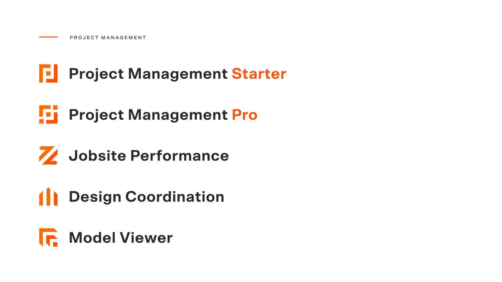
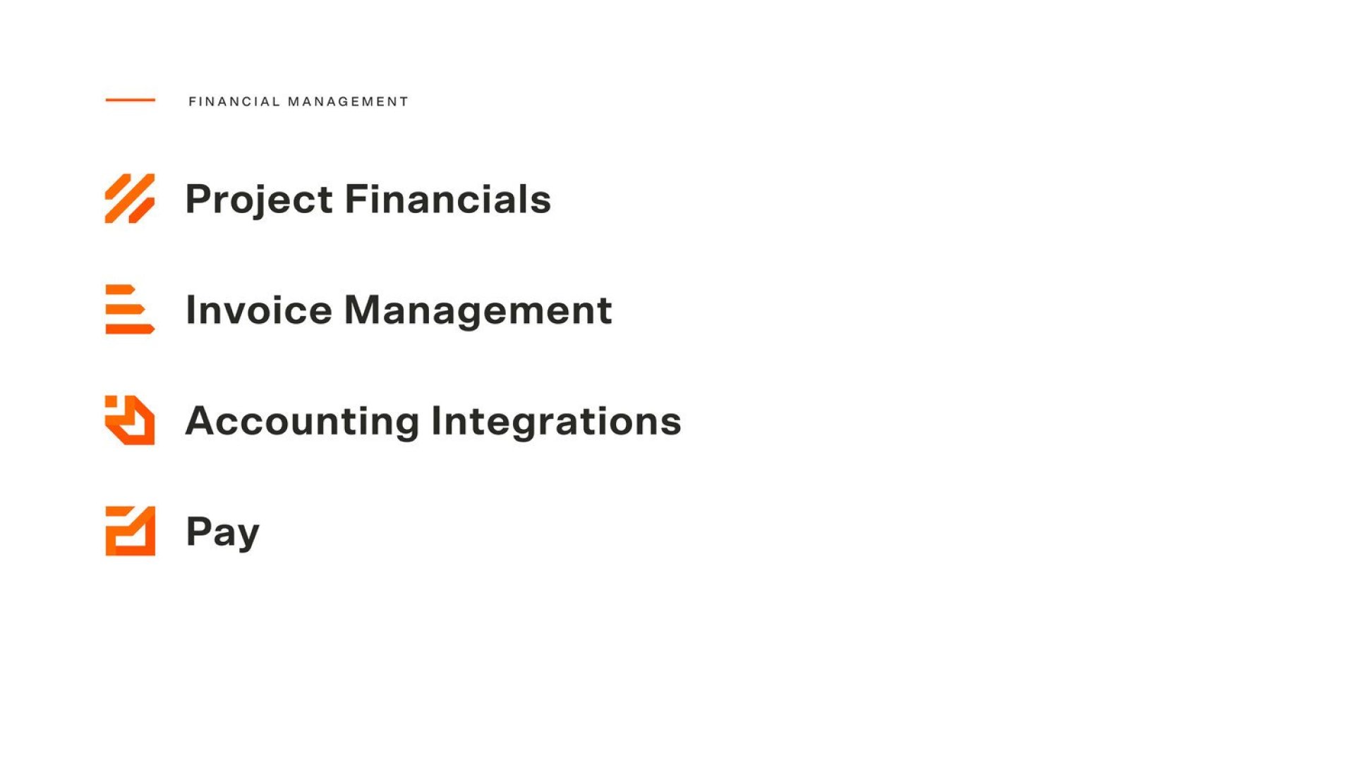
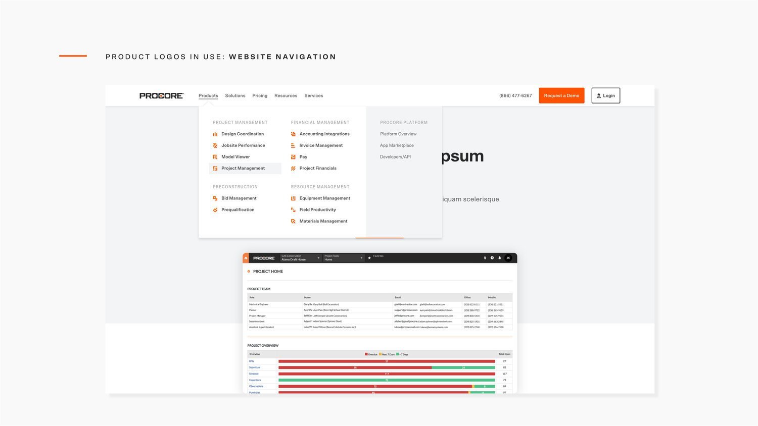
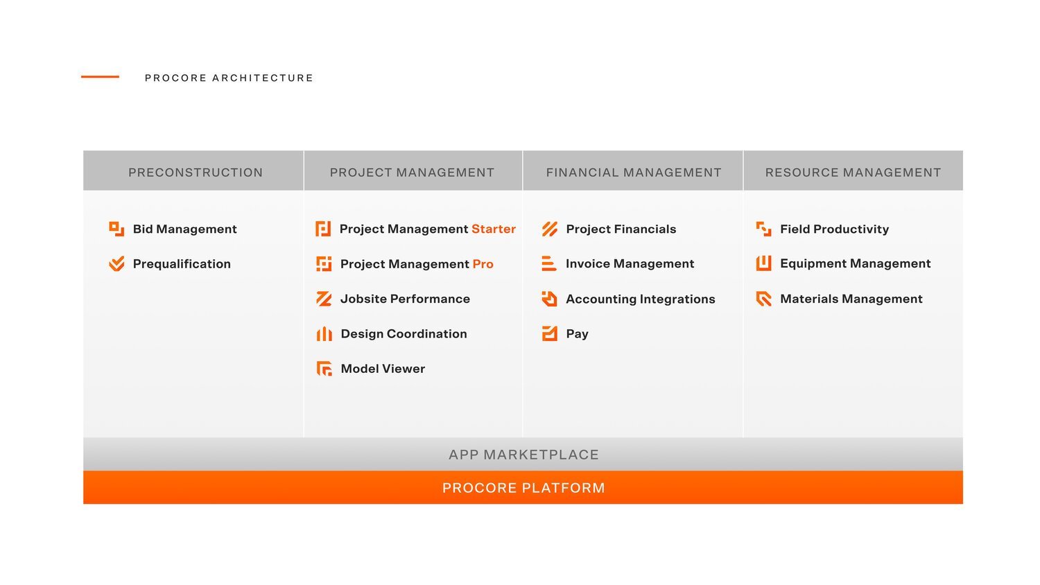
01 — Product Identity System
Icons
The icon system was built inside a 50 x 50px grid using geometric shapes that represent each product in a subtle, abstract form. The system uses a two-color orange palette for depth, with our brand orange always being in the bottom right corner.


02 — Accessible Orange
Orange you glad it’s accessible?
To acquire many government clients, we need to adhere to the WCAG’s Level AA Standards. The contrast ratio provided by our previous brand orange was not compliant for our CTA’s.
A contrast ratio of 3:1 with 14pt bold type is necessary to meet Level AA Standards:

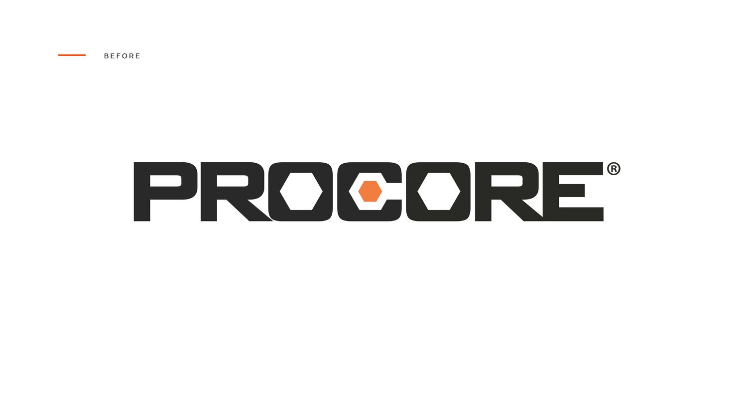
03 — Refreshed Logo
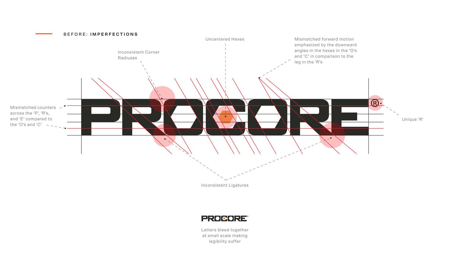
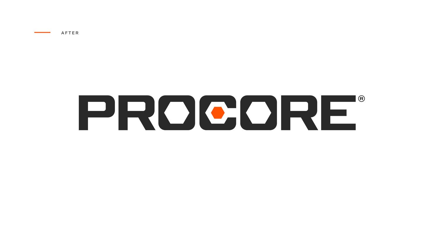
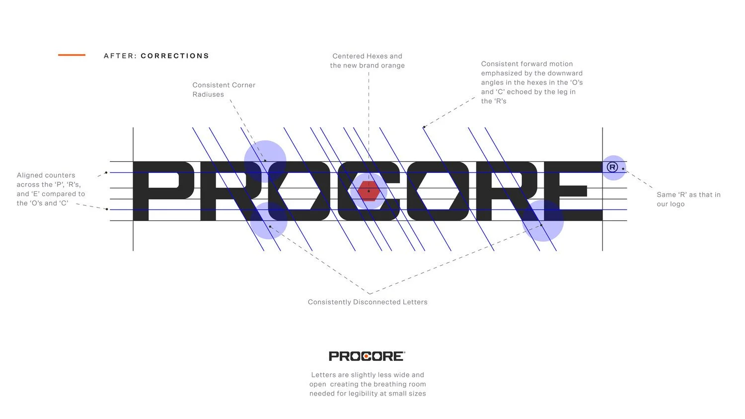
Our logo has brand equity.
However, there are a few imperfections in its construction. We solved these imperfections to improve legibility without sacrificing our brand recognition.
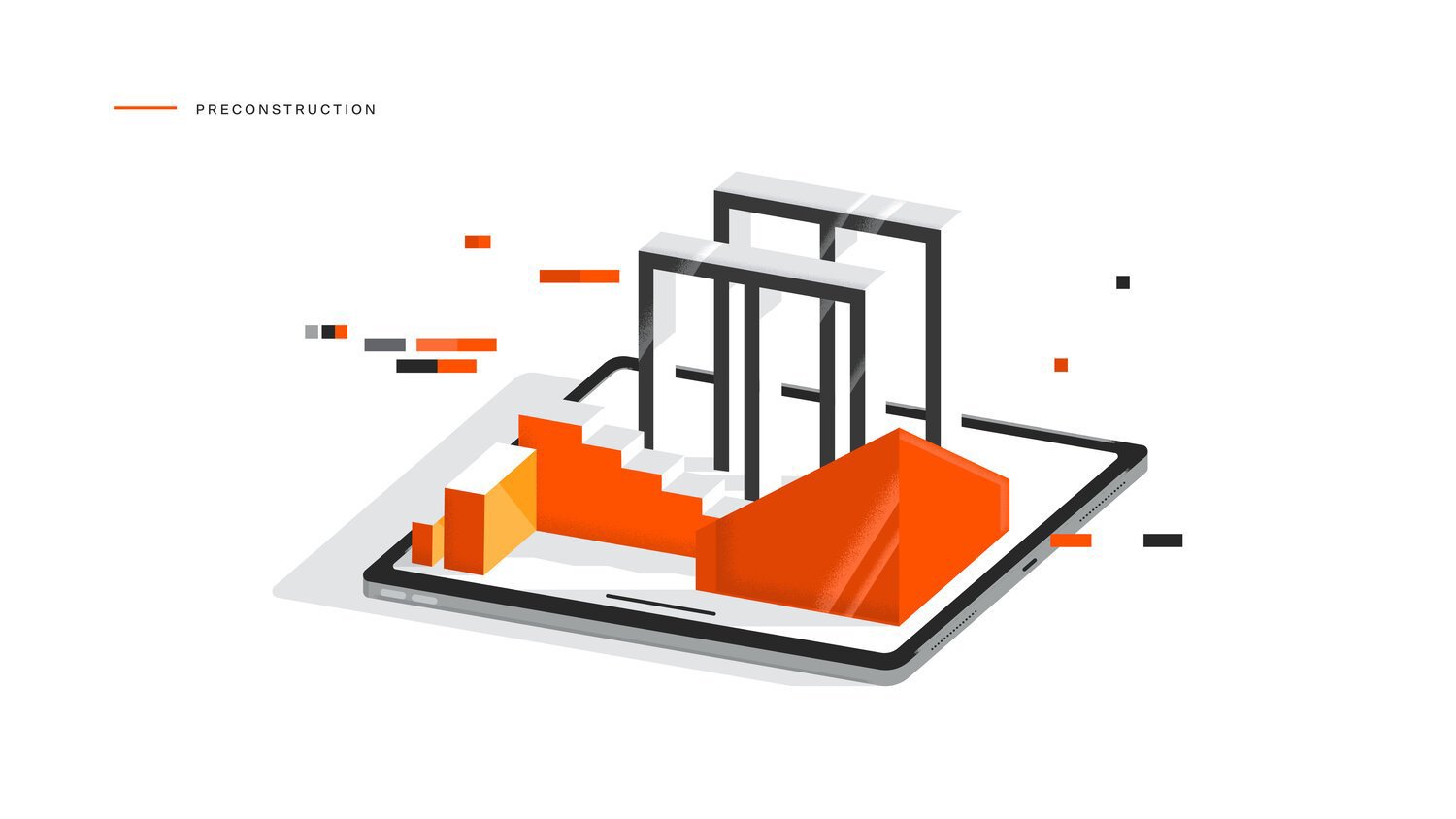
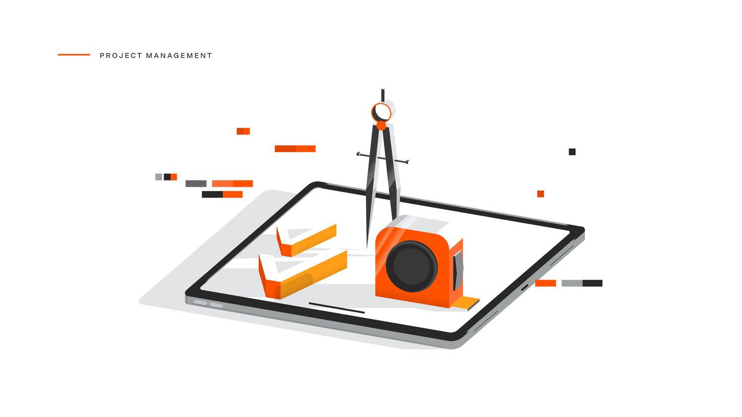
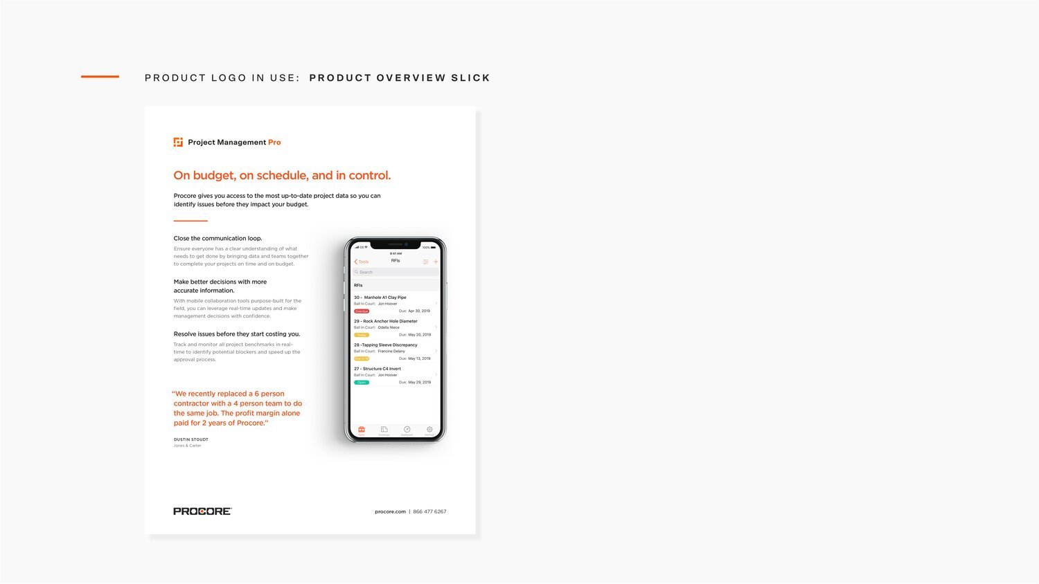
04 — Category Illustrations
Here to make an impact.
To further our exploration, we dived into creative language for each product category unified by the same isometric style.