
AppFolio is a powerful, cloud-based software built to streamline and automate key processes vital to property management. During my time here, I led a team of designers and elevated a rapidly evolving brand in the middle of a flourishing industry, creating solutions driven by authentic customer experiences.
Focusing primarily on brand strategy and compelling storytelling, I developed and maintained five distinct visual languages for industry leading creative. These visual languages were used in different combinations across all applications seen across the brand, each with rich and thorough design systems optimized for scalability, including social, digital advertising, content download experiences, events, and more. The following guide showcases a high level view of the depth of these creative languages.
Brand | Strategy | Art Direction
AppFolio Property Manager
Branding
Art Direction
Digital + Print Design
Advertising
Iconography
Data Visualization
Abstract UI
Illustration

The Brand
The AppFolio Property Manager brand is vast and complex. We believe passionately in intuitive, delightful software. Our creative expression is built around this belief — on communicating in a way that feels human, bold, and rooted in real customer truths.
Through careful consideration, we broke down our visual languages into the following five categories:
Photography
Iconography
Illustrations
Abstract UI
Data visualization
ONE | PHOTOGRAPHY
Elevated.
Human.
Real.


TWO | ICONOGRAPHY
Used with intent.
The AppFolio icon library combines simple shapes to effectively create a rapidly digestible visual language to help promote functionality in the product and unique value services provided by AppFolio.
What they are: Minimal, Distinctive, Deliberate, Supportive
What they are not: Complex, Generic, Cartoony, Overused
Icon Types:
Software
Software icons represent the larger value behind our product features. These icons provide content when communicating the AppFolio how.
Workflow
Workflow icons tie back into our 6 specific product workflows. These icons provide content when communicating the AppFolio why.
Property Type
Property type icons demonstrate the specific properties we interact and engage with, with the purpose of quickly resonating with our target audience.

THREE | ILLUSTRATIONS
Vibrant, charming, optimistic.
AppFolio illustrations are professional and semi-realistic, with a healthy dose of levity and humanness. They represent complex ideas, values, and marketing nomenclature that relate to both prospects and customers to help communicate the AppFolio way.


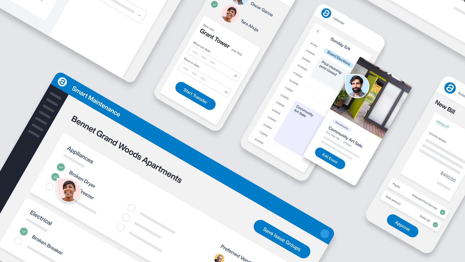
FOUR | ABSTRACT UI
AppFolio’s goal is to be the innovation leader in the real estate space. In order to succeed in that mission, we need to a) innovate and b) have a consistent and visible way we showcase that innovation to the market.
We’ll tie these product updates back into our customer values and outcomes by creating thoughtfully crafted visuals that fall into two types: Value View and Function View.


Prospect Facing
Value View
AppFolio Property Manager is a seamless addition to your everyday.
Customer Facing
Function View
Simplicity and complexity seamlessly combined, to demonstrate a powerful platform with endless solutions.

FIVE | DATA VISUALIZATION
Empowering specific audiences.
AppFolio utilizes data visualization to demonstrate complex data in rapid form. Every design follows three common guidelines: consistent color theory, simplicity over complexity, and first glance impressions

